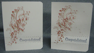
One Layer Congratulations Card
Hello, my crafty friends (and of course my non-crafty friends as well). I'm so happy you could join me today. I have a card that I designed in my head last night to show you. Of course, creating it in my crafty space took so much more than it did in my head. That's OK, because I absolutely love the way it turned out and plan to try some more using the same ideas.
Perhaps we should just get on with the project.
I'm not sure how well the detail shows up in the pictures and the video quality is even worse, but in "real life" these are fabulous! The splotches you see are from the spray mist I used to add that little punch of detail. My goal was to have a contrasting spot on the cards to mimic where I would normally use ribbon (going for that 1 layer look). The flowers tend to blur a bit when you add 2 colors on top of each other. This reminds me of watercolors.
I also used a brand new set of stamps that I had never seen until shopping yesterday. I think this is my FAVORITE set of Tim Holtz stamps. I show you the whole set on the video, so be sure to watch it and you can see how great it is! Also you can see how I added color and dimension to this 1- layer card. I'll also show you all the supplies I used on these pretty little cards. Aren't stamps and ink wonderful?
I plan to enter this card in several challenges. I had these in mind when I was designing in my head.
For this one we were supposed to use the colors and/ or picture and make our take on it. I didn't use all the colors, but I did use the green and black (Plus the red was "close"). This was my inspiration from the photo.
I don't think this one requires much explanation :)
For this challenge you were supposed to also include DOODLING. I don't usually do a lot of doodling (unless I'm on the phone - lol), but the black stitch lines really set off the areas I sprayed from the "white space" areas.
Of course they do...
I'm talkative... hubby is quiet.
I'm a nurse... hubby is an office manager
I strongly dislike black licorice... hubby really likes it
I like my shrimp scampi...hubby really dislikes seafood
OOPS... I don't think that's what they meant. You were supposed to create a project using opposite sides of the Color Wheel. I went with red and green in one of the versions of this card. (BUMMER--I just missed this challenge by about 30 minutes)
Perhaps we should just get on with the project.
I'm not sure how well the detail shows up in the pictures and the video quality is even worse, but in "real life" these are fabulous! The splotches you see are from the spray mist I used to add that little punch of detail. My goal was to have a contrasting spot on the cards to mimic where I would normally use ribbon (going for that 1 layer look). The flowers tend to blur a bit when you add 2 colors on top of each other. This reminds me of watercolors.
I also used a brand new set of stamps that I had never seen until shopping yesterday. I think this is my FAVORITE set of Tim Holtz stamps. I show you the whole set on the video, so be sure to watch it and you can see how great it is! Also you can see how I added color and dimension to this 1- layer card. I'll also show you all the supplies I used on these pretty little cards. Aren't stamps and ink wonderful?
Thanks for watching and have a supercalifragilisticexpealidocious day!


Comments
Thanks so much
Chrissie
"Less is More"
Kristan
Lisa
A Mermaid's Crafts
Thank you very much
mandi
"Less is More"
Amy :) at www.lovetocrop.com
Have a happy day!